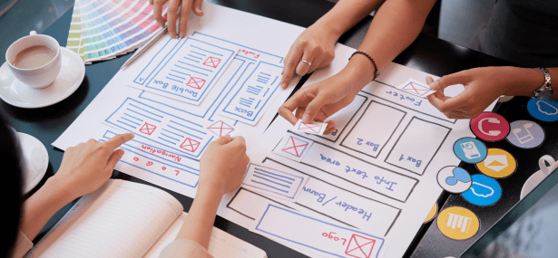
Remember when you first got into business? You probably sent hours thinking about your logo, business name and the look and feel you wanted to create.
When it came to building your website, you thought about the information that you wanted to share – most likely focusing on the images and content so that it captured who you were.
This process is important as people generally look at the home page, about us and contact us pages more than any other!
When it came to writing the content – who were you thinking about? What you wanted to share, or what your potential customers wanted or needed to read?
So often, websites are built as a vanity measure. Something to showcase the brilliance of the individual, rather than as an electronic business card and promotion of their business.
Yes – people buy from people – so we need to know who you are, but that doesn’t mean using jargon, complicated words – when simple will do, or trying to look smarter than everyone else!
Your website is not for you – its for your potential clients. So make sure you are sharing the information they need.


